No ABA uniforms and the short shorts will not be taken into account, because let's face it, those made every uniform look bad.
Atlanta Hawks – 1970-1972
Atlanta Hawks – 1970-1972

Wow…I don’t think I have anything else to say, the picture says it all. Everything about this uniform is terrible, it’s no wonder it only lasted 2 seasons.
Boston Celtics - St. Patrick's Day
 Boston has had the same uniforms since the beginning of time, and they are great, so it's hard to say which is the worst. If I had to pick one it would have to be the annual St. Patrick's day uni's because I don't like the gold lettering, but it's definately the best of the worst on this list.
Charlotte Bobcats - NASCAR Night
 That's right, NASCAR Night. I didn't believe it either, until I saw these disasters. Michael Jordan must really be hurting for fans, and/or ticket sales if he has to result to a NASCAR promotion night with jerseys that have checkered flags on them. Rumor is that the players are only allowed to go left.
Chicago Bulls - 1995-1997
.jpg) Not sure what Chicago was thinking here with red pinstripes. This one thankfully only lasted 2 seasons until they corrected the ugliness, got rid of the pinstripes, and went with plain black like we see today.
Not sure what Chicago was thinking here with red pinstripes. This one thankfully only lasted 2 seasons until they corrected the ugliness, got rid of the pinstripes, and went with plain black like we see today.
Cleveland Cavaliers - TIE- 1969-1974 and 2011-Present Road

 Who thought this looked good? Even in 1969 these were ugly. The worst part is that Dan Gilbert brought them back as throwbacks in recent years. Canary Yellow is NEVER good.
The Cavs finally got it right during the LeBron James era with these uni's, but as soon as he took his talents to South Beach, they reverted back to yellow, and aparently wanted a uniform that matched how bad they were about to be.
Dallas Mavericks - 1981-1992
 As if the dark green wasn't bad enough, they added curly lettering to put it over the top. The Mavs better be greatful for Mark Cuban, who has upgraded the team in more ways than putting good players on the floor.
Denver Nuggets - 1982-1993
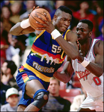 It is baffling that the Nuggets wore these for a decade. Uni's with the Denver skyline, and a rainbow in the background for good measure. I can't imagine what the players must have thought as they suited up every night in this train wreck. This is easily one of, if not the worst, uniforms of all time.
Detroit Pistons - 1978-1981
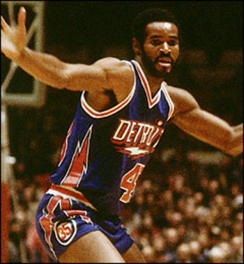 Most people think the ugliest was the old logo with the horse on the front, but that one comes in 2nd when you look at this monstrocity. Lightning bolts everywhere. What does a lightning bolt have to do with a piston? It's no wonder it only lasted 3 seasons.
Golden State Warriors - 1997-2002
 Like Detroit, they have lightning bolts...lots of them. This was the start of the weird, cartoony Warriors era. They have since made major upgrades.
Houston Rockets - 1995-2003
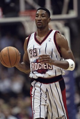 Take one of the worst logos of all time (a cartoon rocket with scary teeth orbiting a planet) and slap it onto some pinstripes, and you get the Rockets uniforms from the Pippen and Barkley era.
Indiana Pacers - 1984-1990
 This one didn't take a lot of effort. Blue jersey, slap some yellow on it...done.
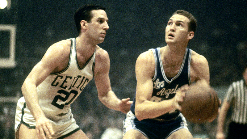
Los Angeles Clippers - 1978-1982
 This one comes from the San Diego Clipper days. Try to ignore Walton's curly red hair, and knee pads...ok I guess you can't. Good thing they moved to LA after just 3 seasons, because these are awful.
Nice form Bill.
Los Angeles Lakers - 1960-1966
 When the Lakers first moved to LA from Minneapolis, they wore these blue uniforms. By far the worst they have had, compared to the traditional purple and gold, and old blue and gold Minneapolis uni's.
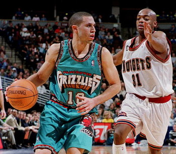
Memphis Grizzlies - 1995-2000
 Holy....Crap. What is this? From the giant grizzly on the shorts, the word grizzlies carved out of rock, to the hieroglyphic trim - and of course the TEAL! The move to Memphis couldn't have happened soon enough to get rid of these monstrosities.
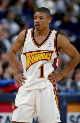
Miami Heat - 1988-1999
 The Heat have had only two uniforms in their short history, both of which are great looking. The current uni is better, so this one loses by default.
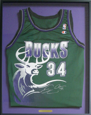
Milwaukee Bucks - 1995-1999

Boston Celtics - St. Patrick's Day
Charlotte Bobcats - NASCAR Night
Chicago Bulls - 1995-1997
Cleveland Cavaliers - TIE- 1969-1974 and 2011-Present Road
The Cavs finally got it right during the LeBron James era with these uni's, but as soon as he took his talents to South Beach, they reverted back to yellow, and aparently wanted a uniform that matched how bad they were about to be.
Dallas Mavericks - 1981-1992
Denver Nuggets - 1982-1993
Detroit Pistons - 1978-1981
Golden State Warriors - 1997-2002
Houston Rockets - 1995-2003
Indiana Pacers - 1984-1990
Los Angeles Clippers - 1978-1982
Nice form Bill.
Los Angeles Lakers - 1960-1966
Memphis Grizzlies - 1995-2000
Miami Heat - 1988-1999
Milwaukee Bucks - 1995-1999
I can't decide if this is terrible or awesome...They put a freaking giant deer on it. If that's not intimidation, I don't know what is.
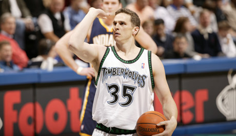
Minnesota Timberwolves - 1996-2008
This uni the Timberwolves had during the Kevin Garnett era loses by default, because Minnesota's current uni's are about as good as it gets. And because the trim on this one has a bunch of little trees...very corny.
Enough about their uniforms, can we talk about how awesome Mark Madsen is?
New Jersey Nets - 1990-1991

The Nets had these light-blue uniforms for one season...and rightly so. Your eyes aren't failing you, there is no glare, there are literally 20 different shades of blue on that uni. Well done New Jersey.
New Orleans Hornets - Alternate 2010-Present

I'll be honest, the purple one from the Charlotte days is probably worse. However, the current alternate for New Orleans has everything that is wrong with uniforms...ugly yellow, TEAL, and pinstripes all on the same shameful uni.
...Fine the purple is worse.
New York Knicks - 1979-1983

Honestly I can't look at this one without laughing. The giant number, dead center on the chest is priceless. A little known fact about the Knicks, aparantly they were sponsored by the Yankees as you can see by the Yankee logo on the shorts.
Oklahoma City Thunder - 1995-2001
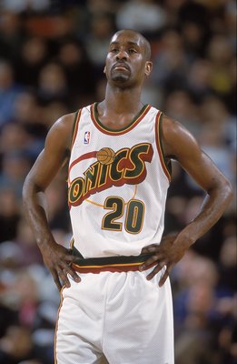
Since moving to Oklahoma City, the Thunder have had the same and only uni so we will have to go back to Seattle to find the worst one. This isn't the worst in history, but the big cartoony "Sonic" across the front isn't the best either.
Orlando Magic - 1998-2003
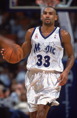
The Magic have a history of good uniforms, but they stuggled with this one. It looks like something you would see at Disney World. Photoshop a Mickey Mouse head onto this picture and tell me I'm lying.
Philadelphia 76ers - 1991-1994

The Sixers might as well have draped an American Flag on them for 3 seasons. My favorite part of this one is that the exact same logo that is on the chest is also on the shorts.
Phoenix Suns - 1992-2000

Another team without a lot of uniform history. The current uni's have the slight edge over this one, because of the sun shooting across the chest. I guess in the 90's it was hard to design a sun with actual flames.
Portland Trailblazers - All of them
They've had basically the same design for their entire history and each one of them are as bad as the others. For some reason they can't get away from the diagnal red and black stripe. Portland should get rid of their current uni's, and wear their alternate "rip city" uni's from here on out, it is far better.
Sacramento Kings - 1990-1994
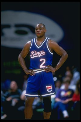
Some franchises have come a long way with their uniform design - The Sacramento Kings are one of them. This boring, blue uni with cursive writing and gigantic numbers is not Sacramento's finest moment. Not to mention one of the worst logos of all time that they put on the shorts. The Kings have improved and today their current uniform is one of the best looking in the league.
San Antonio Spurs - 1983-1989
These are the definition of lazy. The uniforms the San Antonio Spurs wore from '83 to '89 look like something you would see in your local recreation league.
Toronto Raptors - 1995-1999
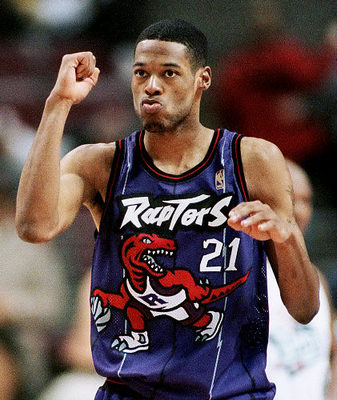
(see Milwaukee Bucks section, except it's a big freaking dinosaur)
Utah Jazz - 1996-2004

These are the grand daddy of them all. Nothing says Jazz music like some purple uniforms with a snowy mountain range. I speak for all Jazz fans when I say I can't believe we watched our team wear these for almost a decade. Without question, one of the worst uniforms in the history of the NBA.
Washington Wizards - Alternate 2006-2009

The Wizards mismatched black and gold alternate uni's came out of nowhere. It was different, but not the good kind of different. It only lasted 3 seasons and was eventually done away with.
No comments:
Post a Comment